Product blog
Product blog
Product updates, field guides, and field notes—each with links to docs and the hub where relevant. High-level milestones also appear on the changelog.
Topic
 Read
ReadField guide · Jun 18, 2026
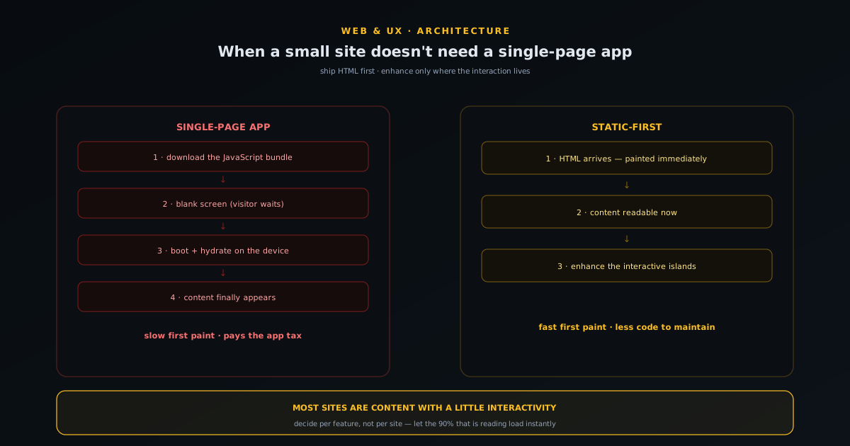
Static-first: when a small site doesn't need a single-page app
A plain-English case for building static-first instead of reaching for a single-page app by reflex: what a SPA actually costs in load time, complexity, and fragility; why most small sites are content with a little interactivity, not apps; what progressive enhancement buys you; how to decide per-feature rather than per-site; and the narrow cases where a SPA genuinely earns its keep.
- Ship HTML first, enhance second
- SPAs cost load time and complexity
- Decide per feature, not per site
Novus Stream Solutions (hub)
 Read
ReadField guide · Jun 16, 2026
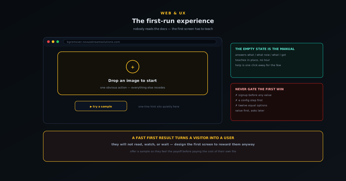
The first-run experience: onboarding a tool nobody reads docs for
How to onboard a tool that no one reads docs for: why the first screen is the only instruction most users will ever see, designing the empty state to teach rather than just sit there, making the single most important action unmissable, getting to a first result fast, and layering help so it is there without being in the way.
- The empty screen is the manual
- One obvious first action
- A fast, visible first win
NSS Background Remover
 Read
ReadField guide · Jun 15, 2026
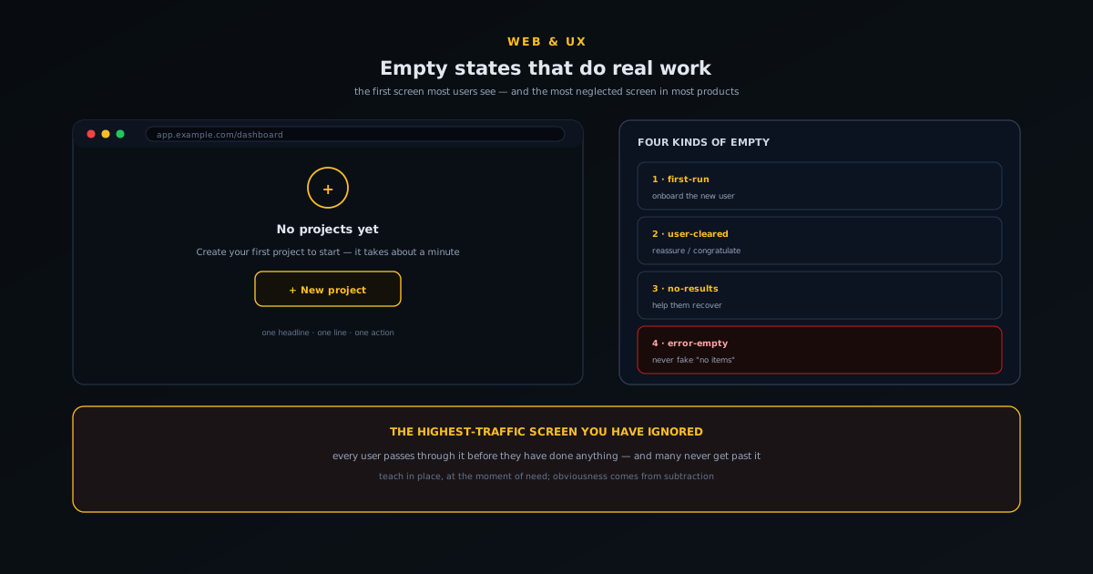
Empty states that do real work: designing the screen users hit first
Why the empty state is the highest-traffic screen you have ignored, the four kinds of empty (first-run, user-cleared, no-results, error-empty) and what each one owes the user, the anatomy of an empty state that does work, and the small copy and design choices that turn a blank screen into momentum.
- The first screen users see
- Four kinds of empty
- Blank screen to momentum
Novus Stream Solutions (hub)
 Read
ReadField guide · Jun 10, 2026
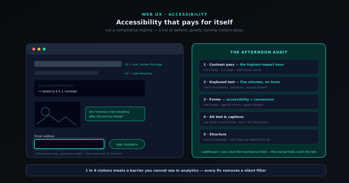
Accessibility that pays for itself: a practical pass for small sites
A working accessibility pass for small-site owners: the overlap between accessible and good, contrast and color, keyboard and focus, forms that explain their errors, alt text and media, heading structure — and how to test all of it in an afternoon with free tools.
- Accessible and usable overlap heavily
- An afternoon covers the big wins
- Free tools test most of it
Novus Stream Solutions
 Read
ReadField guide · Jun 10, 2026
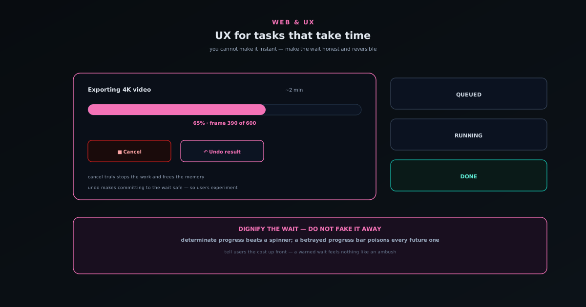
UX for tasks that take time: progress, cancel, and undo
How to design for operations that genuinely take time: the difference between perceived and real performance, why determinate progress beats an endless spinner, building a cancel that actually stops the work, giving slow results an undo so commitment never feels risky, and being honest when something will take a while.
- Honest progress, not a fake spinner
- A cancel that truly stops it
- Undo makes the wait safe
Novus Visualizers
 Read
ReadField guide · Jun 10, 2026
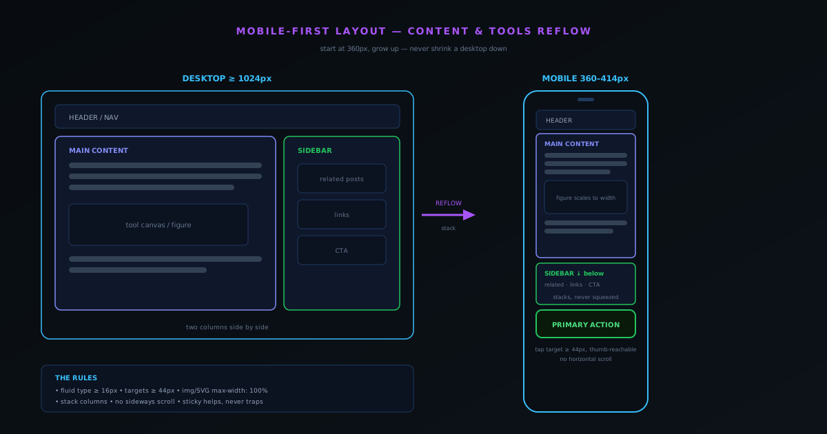
Mobile-first layout for content and tools
Why designing for the phone first produces a better desktop experience too, and the concrete rules that get you there.
- Start at 360px, not 1440px
- Tap targets at least 44px
- Stack, never cram or scroll sideways
Novus Stream Solutions (hub)
 Read
ReadField guide · Jun 7, 2026
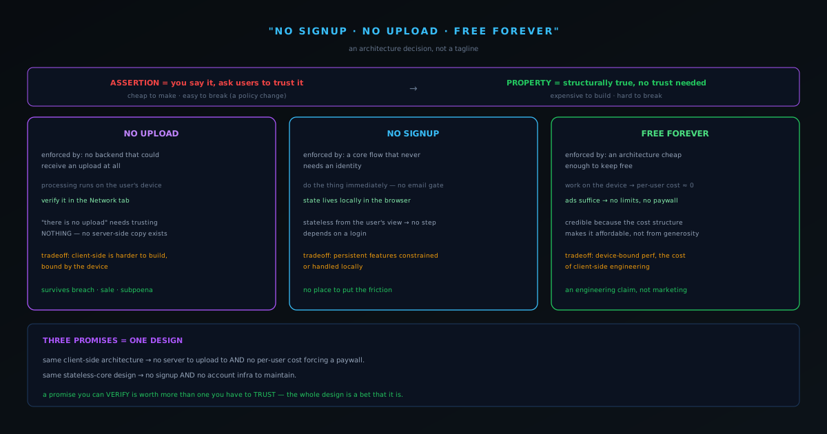
"No signup, no upload, free forever" is an architecture decision, not a tagline
How a marketing-sounding promise becomes a real guarantee when it is built into the architecture instead of written into the footer.
- Promises as constraints
- Enforced by design, not by copy
- The tradeoffs accepted to keep them true
Web & UX
 Read
ReadField guide · Jun 7, 2026
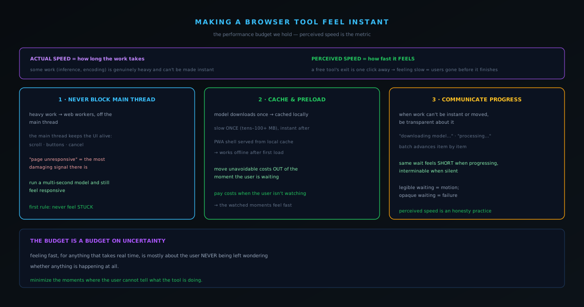
Making a browser tool feel instant: the performance budget we hold
Why a free browser tool has to feel fast to survive, and the specific techniques that buy perceived speed even when real work takes time.
- Perceived speed is the feature
- Never block the main thread
- Cache, preload, communicate progress
Web & UX
 Read
ReadField guide · Jun 7, 2026
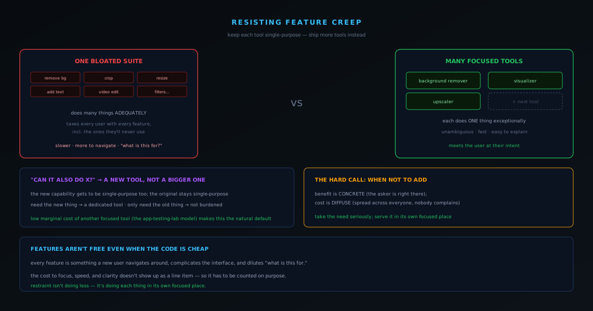
Resisting feature creep: keeping each tool single-purpose and shipping more tools instead
Why a tool that does one thing well beats a suite that does ten things adequately, and how shipping more narrow tools beats growing one wide one.
- One tool, one job
- New tool beats a bigger tool
- Focus is a feature users feel
Web & UX
 Read
ReadField guide · Jun 6, 2026
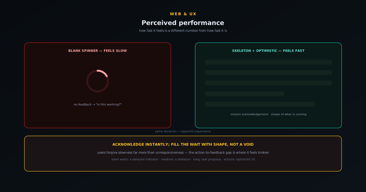
Perceived performance: skeletons, optimistic UI, and the feel of fast
Why perceived speed diverges from measured speed, the toolkit for closing the gap (instant acknowledgement, skeleton screens, optimistic UI, progressive and prioritised loading), when each technique helps and when it backfires, and the honesty line you must not cross when making slow things feel fast.
- Felt speed vs measured speed
- Skeletons & optimistic UI
- The honesty line
Novus Stream Solutions (hub)