2026 · NSS Background RemoverAbout 13 min readNovus Stream Solutions
The first-run experience: onboarding a tool nobody reads docs for
People do not read the manual for a free tool. They open it, glance at the screen, and decide within seconds whether they can get what they came for. Designing the first run for that reality — a teaching empty state, one obvious action, a fast first win — is what turns a curious visitor into a user.
Contents
- 1.Overview
- 2.The first screen is the only instruction most users get
- 3.One obvious action, not a menu of choices
- 4.Get to a first result fast
- 5.Teach by sample, not by lecture
- 6.Layer the help so it is there but not in the way
- 7.The first run is the product’s first impression
- 8.A returning user is not a first-timer
- 9.Mobile first runs are harder, and matter more
- 10.Measure the first run, or you are guessing
- 11.Respect the user who already knows what they want
Overview
There is a polite fiction in a lot of product design that users will read the onboarding. They will watch the welcome tour, follow the tooltips in order, and absorb the documentation before they begin. For a free tool that someone opened from a search result with one specific task in mind, this fiction is simply false. They did not come to learn your tool; they came to remove a background, make a thumbnail, or cut a clip, and they will give the screen a few seconds to convince them it can do that before they bounce back to the results page and try the next link. The documentation you wrote, however good, is read by a tiny minority and almost never before the first attempt.
Designing for that reality is liberating once you accept it, because it collapses the onboarding problem into a single concrete question: when a stranger opens this tool with no preparation and no patience, does the first screen get them to their first result fast enough that they stay? Everything else — the docs, the tutorials, the help — is for the minority who go looking later. The first run is the whole onboarding for almost everyone, and it has to teach without a lesson, guide without a tour, and deliver without a setup. This article is about how to make a first screen do that job.
The first screen is the only instruction most users get
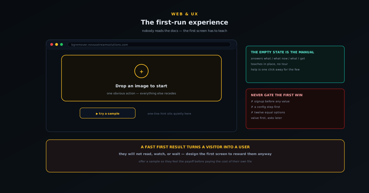
If you internalise one thing, make it this: the empty first screen is your onboarding documentation, because for most users it is the only instruction they will ever see. That reframes the empty state from a placeholder you tolerate into the single most important screen in the product. It has to answer, at a glance and without being read closely, three questions a newcomer is holding: what is this, what do I do first, and what will I get. A first screen that answers those three implicitly, through its layout and its single obvious action, has onboarded the user. One that just shows a blank canvas and assumes they will figure it out has quietly failed the majority before they started.
This is why a thoughtful empty state is worth more than any tour. A tour interrupts; an empty state teaches in place, while the user is already oriented toward doing the thing. The job is not to explain the whole tool — that is what the docs are for, for the people who want them — it is to make the very first step unmistakable and to imply the payoff. The deeper craft of designing a working empty state is its own subject, covered in Empty states that do real work: designing the screen users hit first, but the headline for first-run specifically is that you should pour your onboarding effort into that blank screen rather than into overlays the user will dismiss.
Get to a first result fast
The first run succeeds or fails on time-to-first-result: how long from opening the tool to seeing it do the thing it promised. This is the moment the visitor was actually after, and the faster it arrives the more likely they are to stay, because a fast first win converts curiosity into belief. Anything that stands between the open and that first result is suspect — a signup wall, a settings step, a configuration screen, a permission request that is not strictly necessary yet. Each of these is a place where a user who has not yet seen any value is asked to invest before getting any, and that is exactly the wrong order. Value first, asks later.
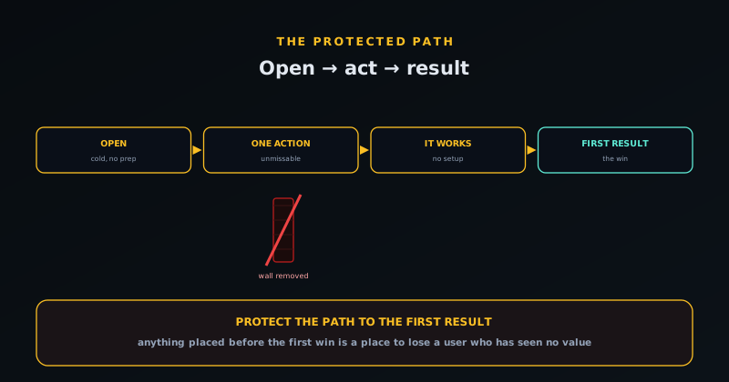
The signup wall deserves singling out because it is the most common and most costly first-run killer. Asking someone to create an account before they have seen the tool do anything is asking them to bet on a promise, and most will not — they will leave and try a tool that just works. The judgement of when an account is genuinely worth requesting is its own decision, argued in When to add accounts to a free tool (and when not to), but the first-run principle is unambiguous: never gate the first win. Let the user reach the result that proves the tool works, and only then, if at all, introduce the account for the things that genuinely need one. The first result is sacred; protect the path to it.
Teach by sample, not by lecture
A powerful and underused first-run technique is to give the user something to act on rather than only a blank space to fill. A sample image they can try with one click, a pre-loaded example, a “try this” shortcut — any of these lets someone experience the tool before committing their own file, which lowers the barrier to the first result to almost nothing. It also demonstrates the workflow by doing rather than describing: the user clicks the sample, watches the tool work, sees the result, and now understands the whole loop without a single sentence of instruction. Showing beats telling, and a sample is the cheapest way to show.
This matters most for tools where providing your own input is itself a small hurdle. If using the tool requires finding and uploading a file, some fraction of curious visitors will not bother on a tool they are merely evaluating — but they will click a sample, because it costs nothing. Once they have seen the result on the sample, providing their own file feels worth it, because now they know what they will get. The sample converts a passive evaluator into an active user by letting them experience the payoff before paying the cost of their own input, which is exactly the sequence a good first run wants.
Layer the help so it is there but not in the way
None of this means help should not exist; it means help should be layered so that the first run stays clean for the majority while the answers are within reach for the minority who want them. The model is progressive disclosure: the first screen shows only the one obvious action; a brief inline hint sits quietly nearby for anyone who pauses; and the fuller help — a getting-started tutorial, an in-context help mode, the docs — is one click away for the person who deliberately goes looking. Nobody is forced through a lesson, and nobody who wants guidance is stranded. The help is present at every level of need without imposing on the level below it.
The mistake at both extremes is instructive. Too little, and the genuinely confused user has nowhere to turn and leaves; too much, and the eager user is buried in tooltips and tours before they have done anything, and leaves for the opposite reason. The balance is to make the common path — open, act, succeed — require no help at all, and to make help unmissable the instant someone signals they want it, for example through a dedicated help mode of the kind described in Designing a help mode that pulses the control you need. Default to clean, escalate to helpful on demand. That layering is what lets a single first screen serve both the user who needs nothing and the user who needs a hand.
The first run is the product’s first impression
It is worth remembering what is actually at stake in those first few seconds. A free tool lives or dies on word of mouth and return visits, and both start with a first run that worked. The user who opened the tool, immediately understood what to do, and reached their result fast is the user who bookmarks it, tells a colleague, and comes back — not because of anything they read, but because the tool respected their time and delivered. Every second of friction before the first result is a tax on that outcome, and every unnecessary ask before any value is a reason to leave.
So the whole discipline of a zero-docs first run comes down to a kind of generosity with the newcomer’s attention: assume they will not read anything, will not watch anything, and will not wait long, and design the first screen to reward them anyway. Make the empty state teach, make the first action obvious, protect the path to the first result, offer a sample to try, and keep help one layer away. Do that, and a stranger who arrived with one task and no patience leaves having done the task — which is the only onboarding metric that ever really mattered. You can feel the difference by opening a tool cold and counting the seconds to your first result.
A returning user is not a first-timer
The phrase “first-run experience” contains its own scope: it is for the first run, and a common mistake is to inflict it on people who are past that point. The user who came back for the third time does not need the teaching empty state, the sample prompt, or the gentle hint about the one obvious action — they know the tool, and showing them the beginner’s scaffolding every time is mildly insulting and quietly slows them down. A first run that cannot tell a newcomer from a regular treats everyone as perpetually new, which is its own kind of friction layered on top of the people you have already won.
The fix is to let the interface graduate as the user does. A returning visitor can land closer to where they left off, with the onboarding affordances dialled back or gone, because the screen no longer has to teach someone who has already learned. This does not require accounts or heavy machinery — even a light local signal that this browser has used the tool before is enough to skip the most explicit hand-holding. The principle is that onboarding is a phase, not a permanent layer, and a thoughtful tool fades the training wheels rather than bolting them on forever. The first run earns its prominence precisely because it is the first; by the third, the user has graduated and the interface should act like it.
Mobile first runs are harder, and matter more
A large share of the strangers arriving from a search result are on a phone, and the mobile first run is both harder to design and more consequential, because the screen is small, there is no hover to reveal hints, and the margin for a confusing layout is far thinner. The one obvious action has to be obvious on a narrow screen without the breathing room a desktop layout enjoys; a drop-zone that reads clearly on a wide canvas can become a cramped, ambiguous box on a phone. If the first action is not unmistakable at mobile size, the time-to-first-result balloons or the visitor simply leaves, and they leave faster on mobile because the whole session is more impatient.
Designing the first run mobile-first rather than as a desktop layout squeezed down forces the right discipline: if the single most important action survives a small screen, it will be more than fine on a large one. It also exposes the cost of clutter mercilessly, because there is no room on a phone for a dozen competing options, which is a healthy constraint that pushes you toward the singular front door the first run wanted anyway. The hover-dependent hint has to become something that works on touch, and the protected path to the first result has to be walkable with a thumb. Treating mobile as the primary first-run surface, not an afterthought, is how you avoid winning the desktop visitor and losing the larger, more impatient mobile audience at the very first screen.
Measure the first run, or you are guessing
Everything above is a set of hypotheses until you measure whether the first run actually works, and the metrics are refreshingly concrete. Time-to-first-result is the headline number: how many seconds, in practice and across real devices, from opening the tool to the first successful output. First-run drop-off is its companion: of the people who arrive, how many reach that first result versus leave before it. Together they tell you whether the first screen is converting curious strangers into users or quietly losing them, and they turn vague design debates into a number you can move. A redesign of the empty state is not better because it looks nicer; it is better if the drop-off falls.
Watching where in the first run people leave is especially valuable because it points straight at the friction. A cluster of exits right after the open suggests the first screen is not making the first action obvious; exits right before the result suggest something between the action and the payoff is too slow or too demanding. Instrumenting the path — open, first action, result — so you can see where the newcomers fall out converts the abstractions of this article into a specific, fixable list. The goal of a zero-docs first run was always behavioural, not aesthetic: a stranger who arrived with one task leaves having done it. Measuring time-to-first-result and first-run drop-off is how you find out whether that is actually happening, rather than assuming it because the screen looks clean.
Respect the user who already knows what they want
A good first run guides the newcomer, but it should never get in the way of the person who arrived knowing exactly what they want to do. Some fraction of every audience are confident, returning, or simply decisive — they want to drop their file and go, and a first run that insists on walking them through a sample or pausing them on an explanatory step treats their certainty as a problem to be managed. The art is to make the guidance available without making it mandatory, so the obvious first action is also the express lane: the same big drop-zone that teaches a newcomer what to do is the thing a confident user uses to skip straight to the result.
This is why the best onboarding for a zero-docs tool is structural rather than procedural. A forced tour, a mandatory walkthrough, a blocking welcome modal — each imposes a pace on a user who may already be moving faster than it allows, and the decisive user experiences them as friction precisely because they did not need the help. Designing the first action to be both the lesson and the fast path means the screen serves the newcomer and the expert with the same element: one teaches by being obvious, the other uses it by being unobstructed. Guidance that you can walk straight past is guidance that helps the people who need it without taxing the people who do not, which is the only kind a confident user will forgive.
Frequently asked questions
Quick answers to common questions about this topic.
How do you onboard users who will not read the documentation?
You treat the first screen as the onboarding, because for most users it is the only instruction they will see. Make the empty state teach what the tool is and what to do first, make the single most important action obvious, get the user to a first result fast, and keep deeper help one click away. The docs are for the minority who go looking later, not the first run.
What is the single biggest first-run mistake?
Gating the first win — most often with a signup wall. Asking someone to create an account or complete setup before they have seen the tool do anything is asking them to invest before getting any value, and most will leave. Let the user reach the result that proves the tool works first, and only then introduce an account for the things that genuinely need one.
Why show one action instead of all the options?
Because a newcomer faced with many equal choices feels stalled, not empowered — they lack the context to choose. Making the single most important action unmissable and letting everything else recede gives the user one clear front door. The depth reveals itself naturally once they are in motion; on the first screen, singular and obvious beats complete and overwhelming.
How does offering a sample help onboarding?
A sample or “try this” lets users experience the tool before committing their own file, lowering the barrier to a first result to almost nothing and teaching the workflow by doing rather than describing. It is especially valuable when providing your own input is itself a hurdle, because curious evaluators will click a sample even when they would not bother uploading a file.
How do I provide help without cluttering the first run?
Layer it with progressive disclosure: the first screen shows only the one obvious action, a brief inline hint sits quietly nearby, and fuller help — a tutorial, an in-context help mode, the docs — is one deliberate click away. The common path should need no help at all, and help should become unmissable the moment a user signals they want it.