2026 · Field notesAbout 12 min readNovus Stream Solutions
Calm analytics: reading your numbers without the anxiety spiral
How to build a metrics practice that gives you signal without the daily anxiety loop—choosing which numbers to watch, when to act, and when to leave them alone.
Contents
- 1.Overview
- 2.Choose three numbers that live rent-free in your head
- 3.Build a weekly review, not a daily refresh habit
- 4.Permission to not act
- 5.Communicating data to people who do not want to see dashboards
- 6.Setting alert thresholds that actually get used
- 7.Quarterly metrics review: resetting the signal list
- 8.The hidden cost of checking too often
- 9.Leading and lagging indicators
- 10.Read every number in its context
- 11.Cohorts tell you more than aggregates
- 12.Build a dashboard that fits on one screen
- 13.When a metric is quietly lying to you
- 14.Emotional discipline is part of the skill
Overview
Data anxiety is not a character flaw—it is a product of checking too many numbers too frequently without a framework for what each number is allowed to tell you. The cure is not fewer dashboards. It is a clear agreement with yourself about which metrics drive decisions.
Vanity metrics are not just useless—they are actively harmful when they occupy the mental space that useful metrics should hold. Follower counts, raw page views, and social impressions are easy to check and hard to act on. Replace them with fewer numbers that connect directly to decisions you make weekly.
Choose three numbers that live rent-free in your head
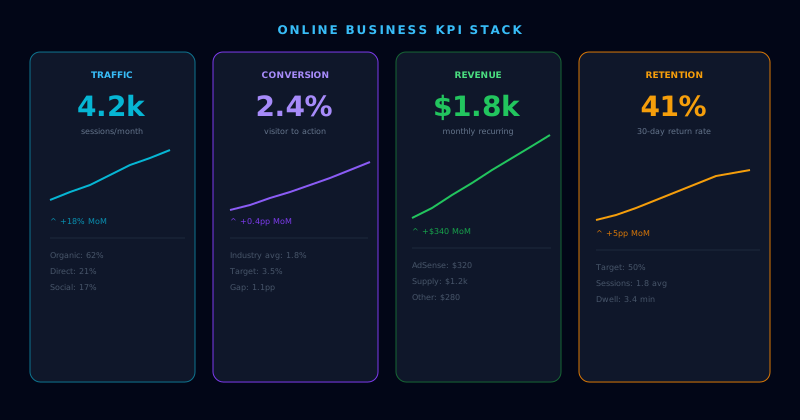
Pick one acquisition metric, one retention metric, and one revenue metric. That is enough to run a small operation. Everything else is investigative—you pull it when the top three show something unexpected.
Write down what action each metric triggers before you commit to tracking it. If you cannot complete the sentence "If this number drops below X, I will do Y," the metric should not be in your weekly view.
Build a weekly review, not a daily refresh habit
Checking metrics daily creates the illusion of responsiveness but mostly generates noise. A weekly review at a fixed time—same day, same context—trains your pattern recognition over time and reduces the emotional volatility of single-day swings.
When a number surprises you, the correct first response is investigation, not reaction. One bad week is a data point. Two consecutive bad weeks is a pattern. Act on patterns.
Permission to not act
The most underrated analytics skill is recognizing when a number is doing what it is supposed to do and leaving it alone. Seasonal dips, post-launch cooldowns, and weekend traffic patterns are not crises. Document your expected ranges so you can spot genuine anomalies without treating every variance as an emergency.
Communicating data to people who do not want to see dashboards
Not everyone on a small team will engage with a metrics dashboard, and that is fine. What matters is that the people making decisions have access to the right signal without having to navigate a tool they find confusing or demoralizing. The simplest version of this is a short weekly summary in plain language: here is what changed this week, here is what it likely means, here is what we are doing about it. That format can be delivered in a Slack message, a quick email, or a shared doc — wherever the team already communicates.
Resist the urge to include everything. A five-metric weekly summary that everyone reads beats a twelve-metric report that sits unread. Curation is a service to your team. If you find yourself defending why something belongs in the report, it probably does not — at least not in the primary view. Move it to a context section that people can consult when they need deeper investigation rather than weekly orientation.
Setting alert thresholds that actually get used
Alert fatigue is the failure mode of well-intentioned monitoring. When every metric has an alert and alerts fire frequently, teams begin to treat them as background noise rather than signals requiring action. The fix is not better alerting tools but better alert design: each alert should correspond to one decision that is time-sensitive enough to interrupt your week. If the alert fires and the right response is "we will look at this in our weekly review," the alert is unnecessary.
Set thresholds based on historical variance, not round numbers. An alert at "below 100 sessions per day" sounds precise but may fire on normal weekend dips if your average is 130. An alert at "below two standard deviations from the 30-day mean" will only fire on genuine anomalies. Spend the extra few minutes calibrating thresholds to your actual data, and you will receive fewer alerts that matter more.
Quarterly metrics review: resetting the signal list
Metrics that were relevant when you chose them may not be the most useful ones six months later. A product in growth mode tracks different leading indicators than a product in retention mode. Business stage determines which signals are worth watching closely and which can move to a quarterly check-in rather than a weekly one. Build a quarterly habit of asking not just "what do these numbers tell us?" but "are these still the right numbers to track?"
The quarterly reset is also the moment to retire metrics that have become disconnected from decisions. Every metric on your regular view imposes a small cognitive cost — you have to interpret it, contextualize it, and decide whether to act. Metrics that never drive a decision should be moved to a reference dashboard rather than the primary view. A primary view that starts lean and stays lean is more likely to be checked regularly than one that gradually accumulates more rows every quarter.
Leading and lagging indicators
A useful distinction for choosing which numbers to watch is between leading and lagging indicators. A lagging indicator measures an outcome that has already happened — revenue, total users, churn for the month — and is valuable for knowing where you stand but useless for changing it, because by the time it moves, the events that drove it are past. A leading indicator measures something earlier in the chain that predicts the lagging outcome — activation rate, early engagement, the behaviors that precede retention — and is actionable precisely because it moves before the outcome does, giving you a chance to influence the result while it is still forming.
A balanced metrics practice watches both but acts mostly on the leading indicators, because they are where intervention is possible. The common mistake is to fixate on the lagging numbers — the revenue, the totals — which are emotionally compelling but informationally late, and to neglect the leading indicators that would have provided early warning. For a small operation especially, the leading indicators are the ones worth building a weekly practice around, because catching a decline in an early-engagement metric weeks before it shows up as churn is the difference between a fixable problem and an accomplished loss. Knowing which of your metrics lead and which lag is what lets you spend your attention where it can actually change the outcome rather than just record it.
Read every number in its context
A number in isolation is nearly meaningless; its significance comes entirely from context — what is normal, what the trend has been, what season or stage you are in. A given week's conversion rate is neither good nor bad until you know your typical range, your recent trajectory, and whether anything unusual happened that week. The discipline of calm analytics is to never react to a raw number without first situating it: is this within the normal band of variation, is it part of an established trend, is there a known explanation. Most numbers that trigger alarm are, on inspection, within normal range or attributable to a known cause, and the context is what reveals that.
Documenting your expected ranges is the practical tool that makes contextual reading possible. When you have written down what a normal week looks like for each key metric, a surprising number can be quickly classified as either within range — and therefore not worth acting on — or genuinely anomalous and worth investigating. Without documented ranges, every variance looks potentially significant, which is exactly the condition that produces data anxiety. The small upfront work of recording your normal bands pays off as a permanent reduction in false alarms, because it lets you distinguish the signal that deserves a reaction from the noise that deserves to be left alone. Context turns a stream of ambiguous numbers into a small set of clear judgments.
Cohorts tell you more than aggregates
An aggregate metric — total active users, overall retention — can hide as much as it reveals, because it blends together groups that may be behaving very differently. A flat total active-user count could mean stable usage, or it could mean you are acquiring new users at exactly the rate you are losing old ones, which is a very different and more concerning situation that the aggregate conceals. Cohort analysis, which groups users by when they joined and tracks each group over time, separates these stories: it shows whether the users who joined this month are retaining better or worse than last month's, which the aggregate cannot.
For a small operation, cohort thinking does not require sophisticated tooling — it requires the habit of asking "which group" rather than only "how many." Looking at whether recent cohorts behave differently from earlier ones reveals whether your product is improving or degrading in ways the totals mask, and it catches problems that aggregates average away. The aggregate is the number that looks reassuring on a good month even when a cohort view would show new users churning faster than ever. Building even a simple cohort habit — comparing how each month's new users behave over their first few weeks — gives you a truer picture of the product's health than any aggregate, because it shows the trend in the experience rather than the sum of all experiences past and present.
Build a dashboard that fits on one screen
The physical design of how you view your metrics shapes whether you actually use them well, and the single most useful constraint is that your primary view should fit on one screen without scrolling. A dashboard that requires scrolling has too many metrics, and the ones below the fold are rarely the most important — they are usually the ones that accumulated because removing a metric felt harder than adding one. Forcing the primary view to fit one screen imposes the curation that keeps the view focused on the few numbers that drive decisions, with everything else relegated to a secondary reference view you consult only when investigating.
The one-screen constraint also makes the weekly review fast enough to actually happen consistently. A review that takes thirty minutes of scrolling through twenty metrics gets skipped under pressure; a review that takes five minutes scanning five decision-driving numbers gets done. The brevity is not a compromise on rigor — it is what makes the rigor sustainable, because a lean view checked every week beats a comprehensive view checked sporadically. Designing the dashboard around the small set of numbers you act on, fitting on one screen, scannable in minutes, is the practical infrastructure that turns the principle of calm analytics into a habit you can keep. The discipline of the view enforces the discipline of the practice.
When a metric is quietly lying to you
Metrics can mislead even when the numbers are accurate, because an aggregate can move for reasons that have nothing to do with the story it appears to tell. A rising average order value might reflect genuinely higher spending, or it might reflect a shift in which customers are buying — the same number, two completely different realities. A stable conversion rate might hide a worsening rate among one segment offset by an improving rate in another. These composition effects mean a metric can point in a misleading direction while every individual number behind it is correct, which is one of the subtlest ways data deceives an operator who reads only the top-line figure.
The defense against a lying metric is to ask what is underneath it before trusting the story it tells — to break an aggregate into its components when it surprises you, and to confirm that the movement reflects the cause you assume rather than a shift in composition. This is the same instinct as cohort thinking: the aggregate is a blend, and blends can move for reasons the blend conceals. An operator who reacts to a moving aggregate without checking its composition can chase a phantom trend or miss a real one hiding behind an offsetting shift. The habit of decomposing a surprising metric, rather than accepting its surface story, is what protects you from acting confidently on a number that is technically true and substantively misleading. Accuracy is not the same as honesty in a metric, and the difference is in the composition the aggregate hides.
Emotional discipline is part of the skill
The hardest part of calm analytics is not technical but emotional: the discipline to not let a number dictate your mood, to sit with a bad week without overreacting, and to resist the comfort of a flattering metric when a less pleasant one is more informative. Numbers carry emotional weight, especially for someone whose livelihood depends on them, and that weight is what turns observation into anxiety. Building the emotional discipline to treat a metric as information rather than judgment — to read a disappointing number with curiosity about its cause rather than dread about its meaning — is as much a part of the practice as choosing the right metrics.
This discipline is learnable and improves with the right structure. The weekly cadence, the documented ranges, the focus on trends over single points, the separation of signal from noise — these are not only analytical tools but emotional ones, because each reduces the volatility that drives the anxiety. An operator who has internalized that a single bad week is mostly noise, and who has the context to confirm it, simply does not experience that week as a crisis. The goal of calm analytics is precisely this calm: a relationship with your data where the numbers inform your decisions without running your emotions, which is both more pleasant and more effective than the anxious daily-checking alternative. The data should serve the operator, not unsettle them, and the discipline is what keeps the relationship in that order.
Frequently asked questions
Quick answers to common questions about this topic.
How do I stop obsessing over analytics?
Check a small set of meaningful metrics on a fixed schedule rather than refreshing constantly. Daily noise rarely changes a decision; a weekly look at the numbers that matter is calmer and just as informative.
Which metrics should a small business actually watch?
The few tied to real outcomes — activation, revenue, retention — not every vanity number a dashboard offers. Fewer, meaningful metrics reduce anxiety and sharpen decisions.